
Week 1 – Week 4 | 22/04/24 – 13/05/24
Emily Soh Ching-Ling | 0359478
Bachelor of Design (Honours) in Creative Media
Advanced Typography | Section 01 | GCD61004
Task 1 — Exercises
TABLE OF CONTENTS
1.0 LECTURES
1.1 WEEK 1 — TYPOGRAPHIC SYSTEMS
TYPOGRAPHIC SYSTEMS:
- Purpose:
- Provides a framework and a sense of purpose.
- Guides decision-making and exploration.
- Factors That Affect Typographic Organisation: Communication, hierarchy, order of reading, legibility, and contrast.
- Eight Major Typographic Systems: Axial, radial, dilatational, random, grid, modular, transitional, and bilateral.
.jpg) |
| Figure 1.1-1: Axial System |
.jpg) |
| Figure 1.1-2: Radial System |
.jpg) |
| Figure 1.1-3: Dilatational System |
.jpg) |
| Figure 1.1-4: Random System |
.jpg) |
| Figure 1.1-5: Grid System |
.jpg) |
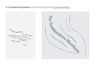
| Figure 1.1-6: Transitional System |
.jpg) |
| Figure 1.1-7: Modular System |
.jpg) |
| Figure 1.1-8: Bilateral System |
1.2 WEEK 1 — INDESIGN FORMATTING
INDESIGN FORMATTING:
- Settings:
- Height: 200 mm
- Width: 200 mm
- Pages: 2
- Facing Pages: ☒
- Columns: 3
- Column Gutter: 5 mm
- Margins: 10 mm (minimum)
- How to Put Separated Pages in The Same Artboard: Pages > [Select both pages] > [Right Click] > Allow Selected Spreads to Shuffle: ☒ > [Drag the 2nd page towards the 1st page]
- Forced Line Break: Shift + Enter
- Vertical Justification (Text Frame Options): Ctrl + B
- Letter spacing on bolded text looks tighter than on non-bolded text.
- *Sidenote: Refresh on Text Formatting (Part 1–4).
1.3 WEEK 2 — TYPOGRAPHIC COMPOSITION
TYPOGRAPHIC COMPOSITION:
 |
| Figure 1.3-1: Principles of Design Composition — Emphasis |
- 1. Principles of Design Composition:
- Emphasis, isolation, repetition, balance (symmetrical and asymmetrical), alignment, perspective, rhythm, and contrast.
 |
Figure 1.4-2: Rule of Thirds
|
- 2. The Rule of Thirds:
- A photographic guide to composition.
- The intersecting lines are used as a guide to place the points of interest.
 |
Figure 1.3-3: Environmental Grid
|
- 3. Environmental Grid:
- Based on the exploration of an existing structure / numerous structures combined.
 |
| Figure 1.3-4: Form & Movement |
- 4. Form & Movement:
- Based on the exploration of existing grid systems.
- The placement of a form on a page, over many pages creates movement.
- The forms could represent: Images, text, and colour
1.4 WEEK 3 — CONTEXT & CREATIVITY
- The first mechanically produced letterforms were designed to imitate handwriting.
- Handwriting would become the basis / standard for form, spacing, and conventions that mechanical type would try to mimic.
 |
| Figure 1.4-1: Cuneiform (c. 3000 BCE) |
- 1. Pictograms:
- The earliest system of writing evolved from pictograms.
- Written from left to right.
 |
| Figure 1.4-2: Hieroglyphs |
- 2. Ideograms:
- Represent the things they actually depict.
- Purpose:
- As determinatives — To show that the signs preceding are meant as phonograms and to indicate the general idea of the word.
- As phonograms — To represent sounds that "spell out" individual words.
 |
| Figure 1.4-3: Letterforms Through the Ages |
- 3. Early Greek:
- Style:
- Drawn freehand. Not constructed with compasses and rulers.
- No serifs.
- Over time, letter strokes became thicker, the aperture lessened, and serifs appeared.
- 4. Roman Uncials:
- Style: By the 4th century, Roman letters were becoming more rounded.
- Rounder form → fewer strokes → could be written faster.
- 5. English Half Uncials (8th century.):
- Style: In England, the uncial evolved into a more slanted and condensed form.
- 6. Carolingian Miniscule:
- Style:
- Capitals at the start of a sentence.
- Spaces between words and punctuation.
- This style became the pattern for Humanistic writing in the 15th century.
- Humanistic writing, in turn, became the basis for the lower-case Roman type.
- 7. Black Letter (12–15th century CE):
- Style:
- Tight spacing and condensed lettering.
- Evenly-spaced verticals.
- Condensed line spacing and letter pacing → reduced cost and materials in book production.
- 8. The Italian Renaissance:
- Newly discovered letterforms: Antica.
- The Renaissance analysis of form (applied to art and architecture) was applied to letterforms → more perfect / rationalised letters.
 |
| Figure 1.4-4: Indus Valley Civilisation (IVC) Script (3500–2000 BCE) |
- 8. Indus Valley Civilisation (IVC) Script:
- The oldest writing found in the Indian subcontinent.
- Yet to be deciphered.
- Somewhat logo-syllabic.
 |
| Figure 1.4-5: Brahmi Script (450–350 BCE) |
 |
Figure 1.4-6: Southeast Asian Scripts
Scripts of the communities that assimilated into the Peninsula Malay communities. |
- 9. Brahmi Script:
- The earliest writing system developed in India after the IVC script.
- One of the most influential writing systems.
- All modern Indian scripts and several hundred Southeast and East Asian scripts are derived from Brahmi.
1.5 WEEK 4 — DESIGNING TYPE
- 1. Research:
- Understand type history, type anatomy, type conventions, and terminology.
- Determine the type's purpose and what different applications it will be used in.
- Study existing fonts that are presently being used for inspiration, reference, context, usage patterns, etc.
- 2. Sketching:
- 3. Digitisation:
- Software: FontLab, and Glyphs.
- Some designers also use Adobe Illustrator and then only the specialised software. This is frowned upon by purists.
- 4. Testing:
- The results of testing are part of the process of refining and correcting aspects of the typeface.
- Prototyping leads to important feedback.
- The readability and legibility of the typeface are important considerations depending on the typeface category.
- Not as crucial is the typeface is a display type, where expression takes more precedence.
- 5. Deploy:
- Revision continues even after deployment.
- Purpose: To ensure that teething issues remain minor.
TYPEFACE CONSTRUCTION:
 |
| Figure 1.5-1: Construction Grid for Roman Capitals (8 × 8 cells) |
- 1. Grids (with circular forms):
- Purpose: To facilitate the construction of letterforms.
- Is a possible method to build / design letterforms.
CONSTRUCTION & CONSIDERATIONS:
 |
| Figure 1.5-2: Classification According to Form & Construction |
- Different forms and constructions must be considered when designing a new type.
- 1. Extrusion of Elements:
- Visual correction: The extrusion of curved and protruding forms past the baseline and cap line (overshoot).
- This also applies to vertical alignment between curved and straight forms.
- 2. Fitting the Type:
- Visual Correction: Adjusting the distance between letters.
- The whitespace between letters should appear uniform.
 |
| Figure 1.5-3: Ink Traps |
- 3. Ink Traps:
- Ink traps were generally used when:
- Printing on cheap, absorbent paper.
- Printing is fast and imprecise.
- Excess ink gathers at the corners, but with ink traps, the corners remain visible.
2.0 INSTRUCTIONS
3.0 EXERCISE 1 — TYPOGRAPHIC SYSTEMS
Instructions:
- Explore the eight typographic systems (axial, radial, dilatational, random, grid, modular, transitional, and bilateral) using the following content:
The Design School,
Taylor's University
All Ripped Up: Punk Influences on Design OR
The ABCs of Bauhaus Design Theory OR
Russian Constructivism and Graphic Design
Open Public Lectures:
June 24, 2021
Lew Pik Svonn, 9AM–10AM
Ezrena Mohd., 10AM–11AM
Suzy Sulaiman, 11AM–12PM
June 25, 2021
Lim Whay Yin, 9AM–10AM
Fahmi Reza, 10AM–11AM
Manish Acharia, 11AM–12PM
Lecture Theatre 12
- Software: Adobe InDesign.
- Size: 200 × 200 mm.
- Resolution: 1024 px, 300 ppi.
- ☑ One other colour, other than black.
- ☑ Graphical elements (e.g. lines, dots), limitedly.
As with most projects, getting into the flow of things proved harder than it should be, especially when you're rusty. Even seemingly simple typographical systems like the axial system took much longer to design. I referenced the book by Kimberly Elam to get an idea of things before I started.
3.1 AXIAL SYSTEM
.jpg) |
Figure 3.1-1: Axial #1.1, Week 1 (25/04/24)
|
|
.jpg) |
Figure 3.1-2: Axial #1.2, Week 2 (02/05/24)
|
My first attempt at this exercise. I saw an axial design on Pinterest with a tilted axis and wanted to do something similar. Despite spending much too long on this attempt (Figure 3.1-1: Axial #1.1), I'm not satisfied with how it turned out. It needs to be more balanced, especially the title.
I remedied the awkwardness of the title and "Open Public Lectures" in Axial #1.2. The design looks cleaner now, though it still looks heavier on the right side.
.jpg) |
Figure 3.1-3: Axial #2, Week 1 (26/04/24)
|
|
I went with a different approach for my second attempt. This time, I utilised the sharp angles of the flush right / flush left text boxes to create the corners of the bounding box. I think the ample white space and simplicity really adds to the illusion.
Fonts used:
- Axial #1.1 & #1.2: Futura Std Bold, Futura Std Book, and Futura Std Light.
- Axial #2: Futura Std Heavy and Futura Std Medium.
3.2 RADIAL SYSTEM
.jpg) |
Figure 3.2-1: Radial, Week 1 (26/04/24)
|
I experimented with lines and circles in this design, since I didn't use any in the previous two systems. I think the lines of varying thicknesses add to the dynamism of the design and create eye movement.
Fonts used: Bembo Std Bold, Bembo Std Bold Italic, Bembo Std Semibold, Bembo Std Semibold Italic, and Bembo Std Regular.
3.3 DILATATIONAL SYSTEM
.jpg) |
Figure 3.3-1: Dilatational #1.1, Week 1 (26/04/24)
|
I tried to create a brush stroke effect by varying the font size and weight.
.jpg) |
Figure 3.3-2: Dilatational #1.2, Week 2 (01/05/24)
|
The centre-most "brush stroke" looked too thin and faded, so I relocated "Open Public Lectures" towards the centre and bolded it.
Fonts used: Univers LT Std 67 Bold Condensed and Univers LT Std 57 Condensed.
3.4 RANDOM SYSTEM
.jpg) |
Figure 3.4-1: Random, Week 1 (28/04/24)
|
When I first started with this design, it looked too much like the transitional system, i.e. the text was too straight and orderly, and lacked the random system's characteristic chaos. I rotated some of the text slightly to give it variation.
I used bold fonts for key information such as the title, dates, and lecture theatre. Also increased the font size for "12", "24", and "25" so that they don't fade into the background.
3.5 GRID SYSTEM
.jpg) |
Figure 3.5-1: Grid, Week 1 (27/04/24)
|
The grids were both helpful and challenging to work with. I experimented with the positioning of the squares before deciding that arranging the orange square by the start of the title 1. looks best, and 2. draws the eye towards the title.
Fonts used: Gill Sans Std Bold Condensed, Gill Sans Std Bold, and Gill Sans Std Regular.
3.6 MODULAR SYSTEM
.jpg) |
Figure 3.6-1: Modular #1.1, Week 1 (26/04/24)
|
.jpg) |
| Figure 3.6-2: Modular #1.2, Week 1 (26/04/24) |
Modular #1.1 and #1.2 are the same design but rotated 90°. It also adheres to the axial system. I think I'll go with my second design since it conveys the same vibe as the first one without sacrificing readability.
Fonts used: Univers LT Std 59 Ultra Condensed, Futura Std Bold, and Futura Std Book.
3.7 TRANSITIONAL SYSTEM
.jpg) |
| Figure 3.7-1: Transitional, Week 1 (28/04/24) |
For the transitional system, I messed around with text layering and incorporating white space in my design. The layered look reminded me of pencil shading, so I leaned into that look by adding thin lines and small dots. The lines and dots also serve as points of focus and leading lines respectively.
Fonts used: Bembo Std Bold, Bembo Std Regular, Bembo Std Italic, Bembo Std Semibold, Bembo Std Semibold Italic, and Bembo Std Extrabold Italic.
3.8 BILATERAL SYSTEM
.jpg) |
| Figure 3.8-1: Bilateral #1.1, Week 1 (24/04/24) |
.jpg) |
| Figure 3.8-2: Bilateral #1.2, Week 1 (24/04/24) |
I wanted to do something interesting with symmetry since all the text will be centred. I experimented with the font size of the title until it resembled a triangle. This gave me the idea to arrange the dates, times and speakers in a way so that the overall form looks like a house (Figure 3.8-1: Bilateral #1.1), as a reference to the meaning of Bauhaus.
I rearranged the two information clusters side by side (Figure 3.8-2: Bilateral #1.2) instead of up and down to make the overall form more obvious.
Fonts used: Futura Std Bold, Futura Std Heavy, Futura Std Book, Futura Std Book Oblique, and Futura Std Light.
3.9 FINAL SUBMISSION
.jpg) |
Figure 3.9-1: Exercise 1 — Axial System — JPEG (Final Submission), Week 2 (02/05/24) |
.jpg) |
Figure 3.9-2: Exercise 1 — Radial System — JPEG (Final Submission), Week 2 (02/05/24) |
|
.jpg) |
Figure 3.9-3: Exercise 1 — Dilatational System — JPEG (Final Submission), Week 2 (02/05/24) |
|
.jpg) |
Figure 3.9-4: Exercise 1 — Random System — JPEG (Final Submission), Week 2 (02/05/24) |
|
.jpg) |
Figure 3.9-5: Exercise 1 — Grid System — JPEG (Final Submission), Week 2 (02/05/24) |
|
.jpg) |
| Figure 3.9-6: Exercise 1 — Modular System — JPEG (Final Submission), Week 2 (02/05/24) |
|
.jpg) |
Figure 3.9-7: Exercise 1 — Transitional System — JPEG (Final Submission), Week 2 (02/05/24) |
|
.jpg) |
Figure 3.9-8: Exercise 1 — Bilateral System — JPEG (Final Submission), Week 2 (02/05/24) |
|
Figure 3.9-9: Exercise 1 (Without Grids) — PDF (Final Submission), Week 2 (02/05/24)
Figure 3.9-10: Exercise 1 (With Grids) — PDF (Final Submission), Week 2 (02/05/24)
4.0 EXERCISE 2 — TYPE & PLAY
4.1 PART 1 — FINDING TYPE
Instructions:
- Analyse, dissect and identify four potential letterforms within an image of a subject (organic or man-made).
- Uppercase or lowercase letterforms only.
- The letterforms should be representative of the subject.
- Use one of the 10 typefaces as a reference.
4.1.1 CHOSEN REFERENCE IMAGE
 |
Figure 4.1.1-1: Reference Image — Oil Spill, Week 2 (03/05/24)
|
I chose an image of an oil spill for this exercise. The shape of the oil (i.e. thin swirls, thick blobs) looks interesting, so I tried to include those characteristics as best I could during dissection.
4.1.2 EXTRACTION OF LETTERFORMS
.jpg) |
| Figure 4.1.2-1: Extracted Letterforms, Week 2 (03/05/24) |
I used Procreate to trace the outline of the letterforms identified. The extracted letters are: "S, L, I, and P".
 |
Figure 4.1.2-2: Retraced Letterforms, Week 2 (05/05/24)
|
I retraced the letterforms using the Pencil Tool in Adobe Illustrator to give them a cleaner look, then placed the letterforms on a baseline.
4.1.3 REFERENCE FONT
 |
Figure 4.1.3-1: Extracted Letterforms VS Reference Font, Week 2 (05/05/24)
|
I used ITC Garamond Std Bold Narrow as my reference font. ITC Garamond Std has the rounded angles that I wanted to preserve in my letterforms, which I find characteristic of oil spills.
4.1.4 REFINEMENT ATTEMPT #1
 |
Figure 4.1.4-1: Refinement Attempt #1 — "S", Week 3 (06/05/24)
|
My first attempt at refinement was not great. After doing the letter "S", I realised it didn't look related to oil spills anymore. It felt rigid and not as fluid as I hoped.
4.1.5 DEFINING FEATURES OF OIL SPILLS
During Mr Vinod's demonstration of deriving letterforms from a stool, I noticed he only took 1–2 key elements from the stool and integrated them into the letterforms.
This made me realise I needed a stronger grasp of my reference image's defining features, so I composed a list of characteristics unique to oil spills before continuing.
- Rounded edges.
- Thinner, wavier strokes branch out from longer, straighter strokes of varying thickness.
- Blobs congregate together.
- Blobs break up longer strokes.
4.1.6 REFINEMENT ATTEMPT #2
 |
Figure 4.1.6-1: Refinement Attempt #2, Week 3 (10/05/24)
|
With a clearer idea of what to do, I set out on my second refinement attempt. I first refined the letter "I", then derived "L" and "P" from it (Figure 4.1.6-1: Green) to maintain consistency. Certain elements were also repeated throughout letterforms (Figure 4.1.6-1: Pink).
 |
Figure 4.1.6-2: Refinement Attempt #2 — "P" Bowl Variations, Week 3 (10/05/24)
|
I extracted a few different shapes from my reference image for the bowl in "P", before deciding on the first one.
4.1.7 REFINEMENT ATTEMPT #3
 |
| Figure 4.1.7-1: Refinement Attempt #3, Week 3 (10/05/24) |
For the final refinement, I deleted unnecessary anchor points and smoothed out some of the sharper edges. I also redid the barb in "S" (Figure 4.1.7-1: Blue) as the original felt too flat.
4.2 PART 2 — TYPE & IMAGE
Instructions:
- Combine the letterforms with an image that is the basis of the extracted letters to create a movie poster.
- Size: 1024 × 1024 px.
- Resolution: 300 ppi.
4.2.1 CHOSEN IMAGE
I chose this image of an ocean oil spill from Pinterest.
4.2.2 BACKGROUND
 |
Figure 4.2.2-1: Adjustment Layers, Week 3 (12/05/24)
|
|
 |
| Figure 4.2.2-2: Chosen Image — Before (Left) & After (Right), Week 3 (12/05/24) |
4.2.3 LETTERFORMS
 |
| Figure 4.2.3-1: Overlaying Letterforms Over Image, Week 4 (13/05/24) |
 |
| Figure 4.2.3-2: Letterforms with Smart Blur, Week 4 (13/05/24) |
I aligned the letterforms (particularly the letter "I") to the swirls in the image so that the text looks like part of the oil spill. I softened parts of the letterforms using the Smart Blur function to make the text less harsh compared to the softer background.
 |
| Figure 4.2.3-3: Lighter Outline & Darker Inside of Oil Spills, Week 4 (14/05/24) |
 |
| Figure 4.2.3-4: Letterforms with Green Outline, Week 4 (14/05/24) |
To further integrate the letterforms with the background, I outlined some parts of my letterforms in a lighter colour. To create this effect, I:
- Duplicated the letterforms.
- Filled the bottom layer with a lighter colour (green).
- Erased the edges of parts of the top layer (brown).
 |
| Figure 4.2.3-5: Rotated Letterforms, Week 4 (14/05/24) |
Rotated the letterforms to make them look less rigid and more fluid.
 |
| Figure 4.2.3-6: Logos & Rating Label, Week 4 (14/05/24) |
 |
| Figure 4.2.3-7: Text Exploration, Week 4 (14/05/24) |
Edited some film production company logos and a rating label in Photoshop to match the poster's colour palette. Completed the poster by adding text.
4.3 FINAL SUBMISSION
.jpg) |
Figure 4.3-1: Exercise 2 — Reference Image (Final Submission), Week 2 (03/05/24)
|
.png) |
Figure 4.3-10: Exercise 2 — Poster — JPEG (Final Submission), Week 4 (15/05/24) |
| Figure 4.3-11: Exercise 2 — Poster — PDF (Final Submission), Week 4 (15/05/24) |
5.0 FEEDBACK
5.1 WEEK 1
General Feedback:
- Typographic systems tend to work in tandem with each other.
- "Chaotic" systems (i.e. random, radial) draw attention.
- "Orderly" systems (i.e. grid, bilateral) get information across.
5.2 WEEK 3
General Feedback:
- The letterforms extracted should be representative of the image.
- The image chosen should have consistent elements.
- The reference typeface should be simplistic.
5.3 WEEK 4
Specific Feedback:
- Don't overblur your letterforms.
General Feedback:
- The text should be integrated with the background.
- E.g. Water effect — Erasing certain parts of the letterforms to create transparency.
- Your poster must be able to communicate clearly.
- Your poster should have logos.
- Make comparative analyses between your poster and good posters.
- Gaps in letterforms that are too small won't be visible when zoomed out.
6.0 REFLECTION
6.1 EXPERIENCE
These past few weeks have been hellish, to say the least. Taking five modules has officially killed my spirit, motivation, and creativity for the rest of this semester. To think that I was excited for this sem to start, lmao.
That aside: I wish we were given more time for Exercise 1. Churning out at least eight designs by Week 2 meant scrapping together whatever I could and calling it a day. This is far from my OK-ish work, much less my good ones. Exercise 2 was alright, I'm quite happy with my final outcome, all things considered.
TL;DR: By far the worst I've felt in months. Currently running on fumes as I'm writing this (please I want to sleep). -100/10.
6.2 OBSERVATIONS
I noticed that I don't do as well creatively with overly specific rules / overly strict guidelines. I was much more efficient and in my element with Exercise 2 than Exercise 1 even though it should be more challenging.
6.3 FINDINGS
This isn't new information, but my current situation really puts into perspective how badly I function under high stress. Considering this is work overload, I don't see how I can remedy this issue save for dropping a module (or two) to lighten the load. Unfortunately, dropping modules will mess up my study plan, so as it stands, I'll have to weather this storm.
7.0 FURTHER READING
7.1 WEEK 1–2 — TYPOGRAPHIC SYSTEMS
 |
| Figure 7.1-1: Typographic Systems by Kimberly Elam |
Reference: Elam, K. (2007, May 3). Typographic Systems. Princeton Architectural Press.
7.2 WEEK 3 — FINDING TYPE: A NOVEL TYPOGRAPHIC EXERCISE
 |
| Figure 7.2-1: Finding Type: A Novel Typographic Exercise by Vinod Nair |
Reference: Nair, V. (2023, August 6). Finding Type: A Novel Typographic Exercise. Kreatif Beats. https://kreatifbeats.com/2023/08/06/finding-type-a-novel-typographic-exercise/

.jpg)
.jpg)
.jpg)
.jpg)
.jpg)
.jpg)
.jpg)
.jpg)
.jpg)
.jpg)
.jpg)
.jpg)
.jpg)
.jpg)
.jpg)
.jpg)
.jpg)
.jpg)
.jpg)
.jpg)
.jpg)
.jpg)
.jpg)
.jpg)
.jpg)
.jpg)
.jpg)

.jpg)

.jpg)
.jpg)
.png)
.png)
.png)
.png)
.png)
.png)
.png)

Comments
Post a Comment