Week 6 – Week 10 | 31/10/23 – 06/12/23
Emily Soh Ching-Ling | 0359478
Bachelor of Design (Honours) in Creative Media
Digital Photography & Imaging | Section 05 | GCD61204
Project 2 — Double Exposure & Conceptual Product Photoshoot
TABLE OF CONTENTS
1.0 LECTURES
1.1 WEEK 6 — POSTER DESIGN
FUNDAMENTALS OF POSTER DESIGN:
- Emphasis
- Balance & Alignment
- Contrast:
- Purpose: To create space and difference between elements in a design.
- E.g. The background and the elements are significantly different colours.
- Repetition:
- Purpose: To unify and strengthen a design.
- E.g. If there's only one thing in blue italic sans serif, it may look like an error. If there are a few things in blue italic sans serif, it looks like a design.
- Proportion:
- Definition of proportion: The visual size and weight of elements in a composition and how they relate to one another.
- Approach your design in sections, as opposed to as a whole.
- Movement:
- Purpose:
- To control elements in a composition so the viewer's eye is led from one element to the next.
- To ensure information is properly communicated to the viewer.
- To create the narrative of the composition.
- White Space (AKA Negative Space):
- Definition of white space: The empty page around elements of a composition.
- Purpose: To give the composition breathing room.
1.2 WEEK 7 — DOUBLE EXPOSURE
DOUBLE EXPOSURE:
- Definition: The merging of multiple images.
- Purpose: To make the collage surreal, emotional, or humorous.
- How to Create Double Exposure:
- Tilt-Shift Effect:
- Blur one of the photos or everything except for one important detail.
- How: Filter > Blue Gallery > Tilt-Shift
 |
| Figure 1.2-1: Tilt-Shift |
- Fake Reflection:
- Create a reflection using a separate photo of a window.
- This can add interesting textures to your photo.
 |
| Figure 1.2-2: Fake Reflection |
- Simple Portraits + Textured Details:
 |
| Figure 1.2-3: Simple Portraits + Textured Details |
|
- Black and White:
- A lack of colour strengthens the emotions in a photo.
 |
| Figure 1.2-4: Black and White |
|
- Two Random Photos:
- Look for interesting shapes, forms, and textures.
 |
| Figure 1.2-6: Two Random Photos |
|
- Simple to Cool:
- Dull photos can be made interesting and otherworldly.
 |
| Figure 1.2-7: Simple to Cool |
|
1.3 WEEK 9 — DIGITAL SURREALISM
REALISM VS SURREALISM:
- Realism:
- Takes subject matters of the ordinary and common world which we call "reality".
- Non-exotic and non-extraordinary subject matter and themes.
- Surrealism:
- A twist on realism.
- It explores the subconscious mind.
- It defies logic.
- Dream images and distorted reality subject matter and themes.
- Common Themes: Strange images and bizarre juxtapositions.
- Example of Surrealists: Salvador Dalí
- Purpose: To promote free association and dream imagery.
DIGITAL SURREALISM:
- Dream-like Scenes & Symbolic Images:
 |
Figure 1.3-1: Dream-like Scenes & Symbolic Images
|
- Unexpected & Illogical Juxtapositions:
 |
| Figure 1.3-2: Unexpected & Illogical Juxtapositions |
|
- Bizarre Assemblages of Ordinary Objects:
 |
| Figure 1.3-3: Bizarre Assemblages of Ordinary Objects |
|
- Primitive / Child-like Designs
 |
| Figure 1.3-4: Primitive / Child-like Designs |
|
2.0 INSTRUCTIONS
3.0 PROJECT 2A — DOUBLE EXPOSURE
3.1 EXERCISE 1
Instructions: Create double exposure using the photos provided.
 |
Figure 3.1-1: Selection & Masking, Week 7 (07/11/23)
|
 |
Figure 3.1-2: Background & Contrast, Week 7 (07/11/23)
|
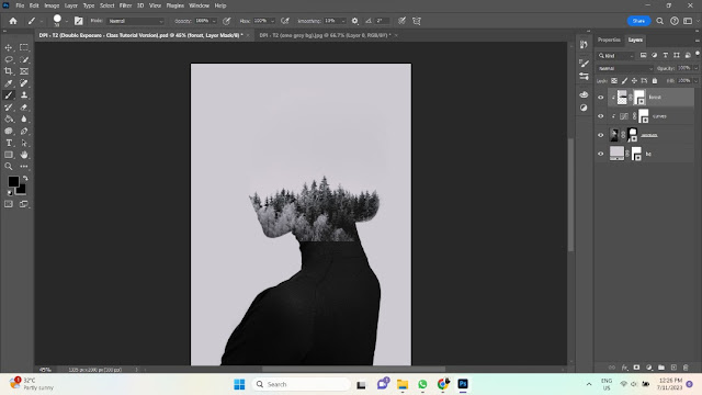 |
Figure 3.1-3: Forest Clipping Mask, Week 7 (07/11/23)
|
 |
Figure 3.1-4: Face in the Trees, Week 7 (07/11/23)
|
 |
| Figure 3.1-5: Clouds & Birds, Week 7 (07/11/23) |
|
 |
| Figure 3.1-6: Green Gradient Map 27%, Week 7 (07/11/23) |
|
.png) |
| Figure 3.1-7: Exercise 1 (Final Submission), Week 7 (07/11/23) |
|
3.2 EXERCISE 2
Instructions: Create double exposure using your own image.
 |
Figure 3.2-1: Selection & Masking, Week 8 (14/11/23)
|
 |
Figure 3.2-2: Background, Contrast & Desaturate, Week 8 (18/11/23)
|
 |
Figure 3.2-3: Arrangement of Images, Week 8 (18/11/23)
|
 |
Figure 3.2-4: Revealing My Face in the Clouds, Week 8 (18/11/23)
|
 |
Figure 3.2-5: Clouds & Background Change, Week 8 (18/11/23)
|
 |
Figure 3.2-6: Grey Gradient Map 50%, Week 8 (18/11/23)
|
.png) |
Figure 3.2-7: Exercise 2 (Final Submission), Week 8 (18/11/23)
|
|
4.0 PROJECT 2B — CONCEPTUAL PRODUCT PHOTOSHOOT
Instructions: Combine two objects to create a hypothetical product in Photoshop.
4.1 IDEATION
C.png) |
| Figure 4.1-1: Mood Board, Week 9 (21/11/23) |
I plan on combining similarly-shaped objects and creating fun new meanings for the new product. Most of the objects are taken from my own home.- #1 Sling Bag × Radio — A portable boombox. Convenient for parties and annoying your neighbours.
- #2 Globe × Glasses — Imagine you could see any part of the world just by putting on some glasses. The possibilities are endless!
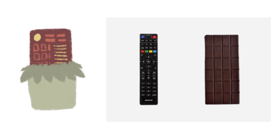
- #3 Remote Controller × Chocolate Bar — Both are rectangular and grid-like. A remote for you to control how your chocolate looks and tastes like.
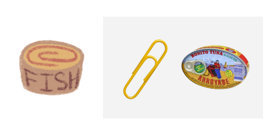
- #4 Paper Clip × Tin Can — At first glance, I mistook the red outline of the tin in Figure 2B9.1 (left) for a giant paper clip. Now you can store your cans by hanging them on a string lol.
- #5 USB × Eraser — The tube (?) in Figure 2B9.1 (middle) kind of looks like a USB connected to an eraser. Useful for university students.
- #6 Ladle × Bag — The power of Mom™ compels you! The bowl part of a ladle reminds me of my mom's handbag.
- #7 Avocado × Egg Yolk — Will this make preparing breakfast easier or weirder? Inspired by Figure 2B9.1 (right).
4.2 SKETCHES
 |
| Figure 4.3-1: Chosen Objects, Week 9 (22/11/23) |
|
 |
| Figure 4.3-2: Glasses — Selection, Week 9 (22/11/23) |
|
 |
| Figure 4.3-3: Globe (Northern Hemisphere) — Selection, Week 9 (22/11/23) |
|
 |
| Figure 4.3-4: Globe (Southern Hemisphere) — Selection, Week 9 (22/11/23 |
|
 |
| Figure 4.3-5: Colour-Matching Northern & Southern Hemispheres, Week 9 (22/11/23) |
 |
Figure 4.3-6: Glasses — Selection & Masking the Sides, Week 9 (23/11/23)
|
 |
Figure 4.3-7: Rearranging Layers & Resizing Objects, Week 9 (23/11/23)
|
 |
Figure 4.3-8: Globes — Slight Warping, Week 9 (23/11/23)
|
 |
Figure 4.3-9: Shadow — Pencil Tool, Week 9 (23/11/23)
|
 |
Figure 4.3-10: Shadow — Gaussian Blur 70%, Week 9 (23/11/23)
|
 |
Figure 4.3-11: Resize Canvas (didn't like how it looked), Week 9 (23/11/23)
|
 |
Figure 4.3-12: Globe (Southern Hemisphere) — Brightness & Contrast, Week 9 (23/11/23)
|
 |
Figure 4.3-13: Globe (Northern Hemisphere) — Brightness & Contrast, Week 9 (23/11/23)
|
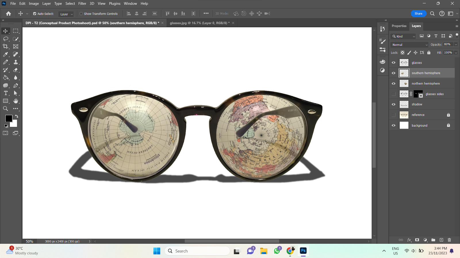 |
Figure 4.3-14: Globe (Both Hemispheres) — Opacity 80%, Week 9 (23/11/23)
|
 |
Figure 4.3-15: Erase Side of Glasses, Week 9 (23/11/23)
|
 |
Figure 4.3-16: Background, Week 9 (23/11/23)
|
 |
Figure 4.3-17: Levels, Week 9 (23/11/23)
|
 |
Figure 4.3-18: Curves, Week 9 (23/11/23)
|
 |
Figure 4.3-19: Highlights — Gaussian Blur & Lighten 50%, Week 9 (23/11/23)
|
.png) |
Figure 4.3-20: Conceptual Product Photoshoot (Final Submission), Week 9 (23/11/23)
|
|
5.0 FEEDBACK
5.1 WEEK 10
Specific Feedback: Good work!
6.0 REFLECTION
6.1 EXPERIENCE
This assignment was really fun, especially Project 2B since we got to come up with our own "product". Way more laid-back than other courses lol. I found Project 2A a bit difficult since I'm not too familiar with clipping masks, so that wasn't as enjoyable, but with enough practice, I believe I can master it.
6.2 OBSERVATIONS
My Photoshop skills have gotten much better with consistent practice. I noticed I did much better when I finished an exercise within a day or two of starting, rather than starting the exercise, and then leaving it for a long time before coming back again. I'll have to remember to finish my work while my memory is still fresh for other assignments.
6.3 FINDINGS
While I have improved a lot since I first started Photoshop, I still have a hard time memorising certain shortcuts and processes, especially processes with many steps. I've started recording the step-by-step of commonly done processes (e.g. how to make shadows) in my notebook. That way, I can refer to it when I'm doing my assignments, and I don't need to waste time looking it up on Google.


.png)

.png)
C.png)


.png)
Comments
Post a Comment