Week 1 – Week 4 | 26/09/23 – 17/10/23
Emily Soh Ching-Ling | 0359478
Bachelor of Design (Honours) in Creative Media
Digital Photography & Imaging | Section 05 | GCD61204
Project 1 — Physical Collage Design & Digital Imaging
TABLE OF CONTENTS
1.0 LECTURES
1.1 WEEK 1 — INTRODUCTION
We were introduced to DPI along with the expectations and objectives of the module. We were also shown some of our seniors' works and given a taste of future assignments.
1.2 WEEK 2 — INTRODUCTION TO BASIC COMPOSITION
INTRODUCTION TO BASIC COMPOSITION:
- Focal point - Important pieces of the design
- Scale & Hierarchy - Draw attention towards and away from certain elements
- Balance - Distribution of visual weight
- White Space - Breathing room
- Rule of Thirds
- Imaginary grid that divides the canvas into nine parts.
- Important elements should be placed on intersection points.
- Golden Ratio - A guideline which creates balance and harmony.
1.3 WEEK 3 — INTRODUCTION TO PHOTOSHOP (PART 2)
LASSO TOOL, PEN TOOL & LAYERING:
- Lasso Tool:
- The lasso tool allows you to draw and pinpoint specific areas of a document.
- The lasso tool is a selection tool.
- Types of Lasso Tool: Lasso Tool, Polygonal Lasso Tool, Magnetic Lasso Tool
 |
Figure 1.3-1: Lasso Tool
|
- Pen Tool:
- The pen tool allows you to create a path from scratch.
- The fewer the anchor points, the smoother the path.
 |
| Figure 1.3-2: Pen Tool |
1.4 WEEK 4 — INTRODUCTION TO PHOTOSHOP (PART 3)
ADJUSTMENT LAYERS & FILTERS:
- Brightness / Contrast:
- Makes adjustments to the tonal range of the image.
- Brightness — Adjusts the highlights.
- Contrast — Adjusts the shadows.
- Level:
- Makes adjustments to the tonal value of the image.
- Makes adjustments to the level of shadows, mid-tones and highlights.
- Curves: Makes adjustments to the points throughout the tonal range of an image.
- Exposure:
- Makes adjustments to the exposure levels of the image.
- Exposure — Adjusts the highlights.
- Offset — Adjusts the mid-tones.
- Gamma — Adjusts the dark tones.
- Selective Colour: Makes adjustments to the level of primary colour in an image w/o modifying the other primary colours.
- Filters: Changes the colour, adds blur, or creates new effects on the image.
1.5 WEEK 5 — DOUBLE EXPOSURE
COMPONENTS OF A DSLR CAMERA:
- Camera Body: Shutter, image sensor, LCD screen
- Camera Lens: Aperture / Iris
EXPOSURE SETTINGS:
- Aperture / Iris:
- Purpose: Controls the flow of light entering the lens.
- Aperture is measured in f-stop, e.g. f/1, f/1.4, f/2...
- The smaller the f-stop number, the larger the lens opening.
 |
| Figure 1.5-1: Aperture |
- Shutter Speed:
- Purpose: Opens and closes to allow and prevent light from reaching the film.
- Shutter speed is measured in seconds, e.g. 1/1000s, 1/500s, 1/250s...
- The shorter the second, the clearer the image.
 |
| Figure 1.5-2: Shutter Speed |
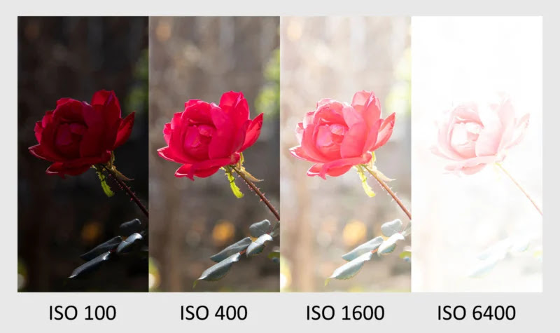
- ISO:
- ISO definition: The sensitivity of the camera's sensor.
- Common ISO settings: 100, 200, 400, 640, 800, 1600, 3200...
- The lower the number of ISO, the darker the image and the finer the grain.
 |
| Figure 1.5-3: ISO |
 |
| Figure 1.5-4: Relationship Between Aperture, Shutter Speed & ISO |
LENS PERSPECTIVE:
- Types of Lenses:
- Wide angle lens
- Standard lens
- Telephoto lens
 |
Figure 1.5-5: Types of Lenses
- Focal Length:
- The shorter the focal length, the wider the angle of view.
Figure 1.5-6: Focal Length - Depth of Field:
- The smaller the aperture, the greater the depth of field.
|
Figure 1.5-7: Depth of Field
2.0 INSTRUCTIONS
3.0 PROJECT 1A — COLLAGE
3.1 FAVOURITE GRAPHIC DESIGN COMPOSITIONS
Instructions: List down your 3 favourite graphic design composition works from Pinterest. Explain it on your e-portfolio blog, why do you like the designs?
3.1.1 STAND STILL, STAY SILENT
This image is taken from the webcomic "Stand Still, Stay Silent" by Minna Sundberg. It's a story about friendship and exploration in a world abandoned by time.
The composition of the photographs is reminiscent of found footage, as though the characters left behind snapshots of their lives for the viewer to find.
It fully encapsulates the warmth and whimsy that the comic offers while illustrating the importance of friendship and family in dire times.
3.1.2 A SERIES OF UNFORTUNATE EVENTS
This book cover of "A Series of Unfortunate Events" by Lemony Snicket was illustrated by Karl James Mountford. The story is about the Baudelaire siblings who have to face the devious plans of their guardian Count Olaf as they investigate their parents' tragic death.
The way the artist framed the dilapidated furniture around and above the siblings illustrates the danger they are constantly in.
The monochromatic red colour palette and the inferno in the background further accentuate their perilous situation.
3.1.3 ONCE MORE TO THE LAKE
This image is taken from the essay "Once More To The Lake" by E. B. White, designed by Jamie Randazzo. The essay reflects upon the author's memories of the lake as a child and the memories he create with his son many years later. Toth Brand Imaging commissioned Randazzo to visually breathe life into "Once More To The Lake" through the use of type.
The boat cuts across the page in a way that guides the viewer's eye through the page, emphasising the upper left corner where the text begins.
The stern wake leaves the viewer breathing room on an otherwise packed visual.
3.2 COLLAGE DESIGN ELEMENTS
Instructions: Identify and cut out the design elements for your collage. Compose it into your own concept and story.
 |
Figure 3.2-1: Materials, Week 2 (05/10/23)
|
 |
Figure 3.2-2: Composition #1, Week 2 (05/10/23)
|
 |
Figure 3.2-3: Composition #2, Week 2 (05/10/23)
|
 |
Figure 3.2-4: Composition #3, Week 2 (05/10/23)
|
.png) |
| Figure 3.2-5: Collage (Final Submission), Week 3 (12/10/23) |
4.0 PROJECT 1A — DIGITAL COLLAGE
4.1 THE BÉZIER GAME
We were encouraged to play the Bézier Game (a game for learning the Adobe Illustrator pen tool). I have completed the game up till the car stage. It wasn't too difficult for me as I've already done the game during Illustration & Visual Narrative.
 |
| Figure 4.1-1: The Bézier Game, Week 3 (10/10/23) |
4.2 COMPOSITING COLLAGE
Instructions: Create 3 A4-sized digital collages using the images provided.
I started off by sketching out my collages in Procreate.
-1.png) |
Figure 4.2-1: Composition #1 Sketch, Week 3 (16/10/23)
-1.png) | Figure 4.2-2: Composition #2 Sketch, Week 4 (17/10/23)
-1.png) | Figure 4.2-3: Composition #3 Sketch, Week 4 (17/10/23)
|
|
|
Satisfied with my sketches, I digitised them in Illustrator with minor changes.
.png) |
Figure 4.2-4: Composition #1, Week 4 (17/10/23)
|
.png) |
Figure 4.2-5: Composition #2, Week 4 (17/10/23)
|
.png) |
| Figure 4.2-6: Composition #3, Week 4 (17/10/23) |
4.3 DIGITAL COLLAGE
Instructions: Improve your digital collage using Adjustment Layers and Filters in Photoshop.
I changed the colour palette many times before deciding that it looked best in black, white, and blue. I adjusted the colour of the smaller fish to teal and increased the brightness of the building and the bigger fish so that the entire artwork looked harmonious.
 |
| Figure 4.3-1: Composition #2 VS Readjusted Composition #2, Week 4 (17/10/23) |
.png) |
Figure 4.3-2: Digital Collage (Final Submission), Week 4 (17/10/23)
|
5.0 PROJECT 1B — DIGITAL IMAGING EXERCISE 1
Instructions: Photoshop Shazam and yourself into the Hearst Mansion.
5.1 SHAZAM
.png) |
Figure 5.1-1: Shazam (Final Submission), Week 5 (24/10/23)
|
5.2 MY REFLECTION
 |
Figure 5.2-1: My Reflection — Quick Selection, Week 5 (28/10/23)
|
 |
Figure 5.2-2: My Reflection — Resizing & Repositioning, Week 5 (28/10/23)
|
 |
Figure 5.2-3: My Reflection — Match Colour, Week 5 (28/10/23)
|
 |
Figure 5.2-4: My Reflection — Colour Balance, Vibrance, Saturation & Filter, Week 5 (28/10/23)
 | Figure 5.2-5: My Reflection — Add Noise, Week 5 (28/10/23)
|
 | | Figure 5.2-6: My Reflection — Shadow, Week 5 (28/10/23) |
 | Figure 5.2-7: My Reflection — Reflection, Week 5 (28/10/23)
|
.png) | | Figure 5.2-8: My Reflection (Final Submission), Week 5 (28/10/23) |
|
6.0 PROJECT 1B — DIGITAL IMAGING EXERCISE 2
6.1 PART 1
Instructions: Colourise a black and white photo.
 |
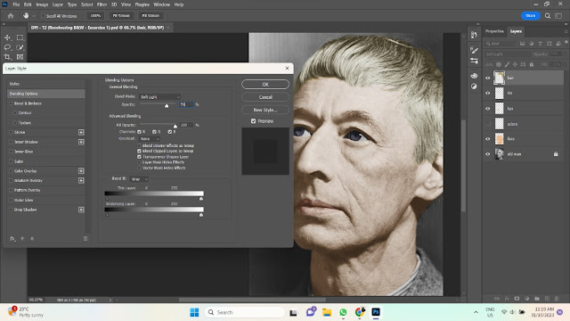
| Figure 6.1-1: Face — Soft Light, Week 6 (31/10/23) |
 |
| Figure 6.1-2: Lips — Soft Light, Week 6 (31/20/23) |
 |
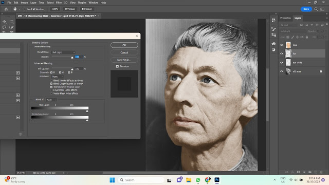
| Figure 6.1-3: Iris — Overlay 50%, Week 6 (31/10/23) |
 |
| Figure 6.1-4: Hair — Soft Light 76%, Week 6 (31/10/23) |
 |
| Figure 6.1-5: Shirt — Soft Light, Week 6 (31/10/23) |
 |
| Figure 6.1-6: Background — Soft Light 40%, Week 6 (31/10/23) |
.png) |
| Figure 6.1-7: Part 1 (Final Submission), Week 6 (31/10/23) |
6.2 PART 2
Instructions: Colourise a black and white photo (advanced).
 |
| Figure 6.2-1: Colour Selection, Week 6 (04/11/23) |
 |
| Figure 6.2-2: Hair — Soft Light, Week 6 (04/11/23) |
 |
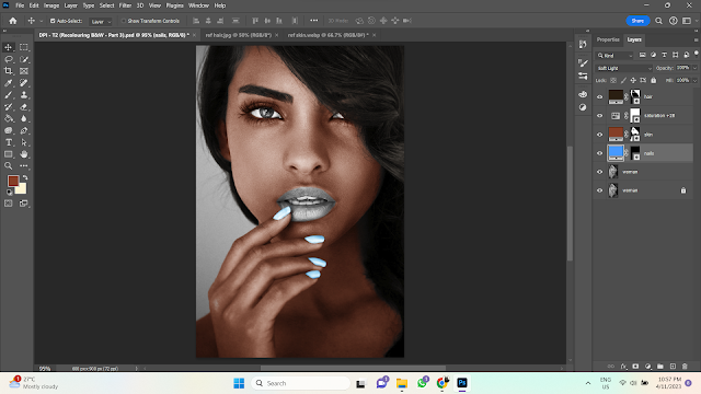
Figure 6.2-3: Skin — Soft Light & Saturation +100, Week 6 (04/11/23)
|
 |
| Figure 6.2-4: Sclera — Soft Light 50%, Week 6 (04/11/23) |
 |
| Figure 6.2-5: Lips & Teeth — Overlay, Week 6 (04/11/23) |
 |
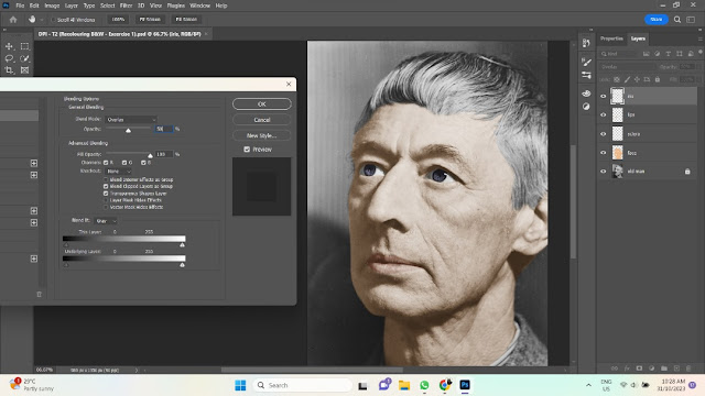
| Figure 6.2-6: Iris — Soft Light 55%, Week 6 (04/11/23) |
 |
| Figure 6.2-7: Coat — Overlay, Week 6 (04/11/23) |
 |
| Figure 6.2-8: Earring — Overlay 60%, Week 6 (04/11/23) |
 |
| Figure 6.2-9: Background — Soft Light, Week 6 (04/11/23) |
.png) |
| Figure 6.2-10: Part 2 (Final Submission), Week 6 (04/11/23) |
7.0 FEEDBACK
7.1 WEEK 2
Specific Feedback: Good practice. You may choose Composition #2 for your collage submission in Task 1 later on.
7.2 WEEK 3
Specific Feedback: Good series of collages. You may choose Composition #2 for your final collage.
8.0 REFLECTION
8.1 EXPERIENCE
The whole process was relatively smooth sailing. Other than a few bumps along the road (i.e. Me being new to Photoshop), Project 1 has been enjoyable and not too stressful.
I enjoy the fact that homework is consistent and there's a new exercise every week. Compared to the way assignments in Foundation in Design were handled, assignments in BDCM are less anxiety-inducing.
8.2 OBSERVATIONS
I noticed that, compared to my understanding of the other Adobe software, I am not very good at Photoshop. I think Photoshop's layout really threw me off even though it wasn't too dissimilar from Illustrator.
Update: I've been getting better with Photoshop as the weeks go on. I would even say that it's quite enjoyable!
8.3 FINDINGS
Photoshop: The white edges around selected objects aren't visible on artboards. No need to spend too much time removing them.😅


.png)

-1.png)
-1.png)
-1.png)
.png)
.png)
.png)
.png)
.png)


.png)


.png)
.png)


.png)
Comments
Post a Comment